Brand Project
- Olivia Kissinger
- Oct 30, 2018
- 1 min read
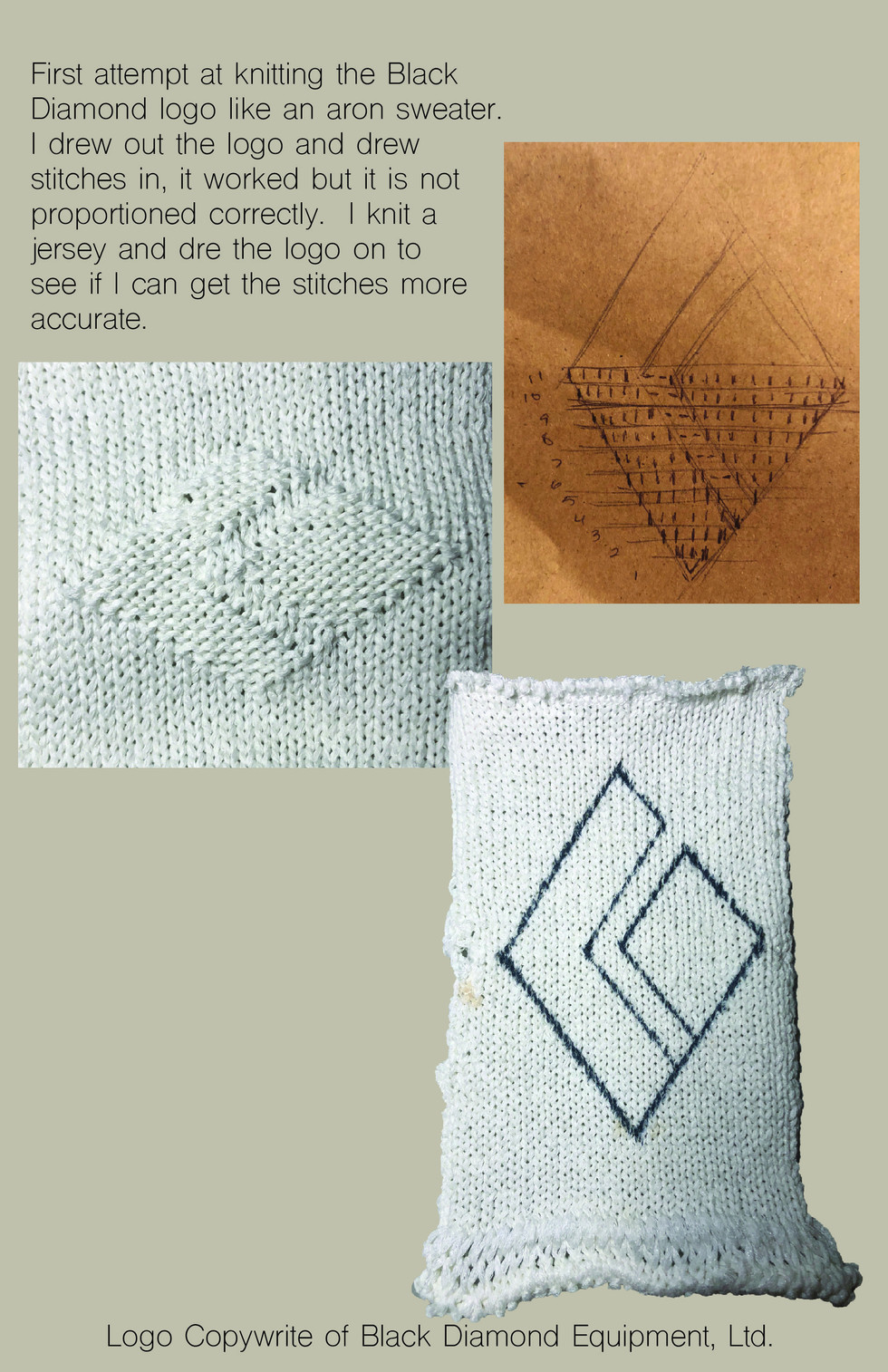
The brand I decided to use for my project is Black Diamond. I feel like they have a few lifestyle pieces for sale currently but that they can expand it greatly. I also have ideas for cool backpacks and shoes for climbers so I will be doing accessories in this collection as well as lifestyle. I have chosen a color pallete but I am not sure about it, so if anyone has suggestions let me know. The page after my color pallete is the beginning of my customer profile, I am surveying people and interviewing people for a more in depth customer profile. Fabrics wise I am unsure what to do, the fabrics I currently have are inferior to what Black Diamond uses, however I found a new website to order from so once those swatches come in I will see what I have to work with there. I also have pictures of swatches from the materials library that I took when I was researching that I may use in the collection, they are included at the end of my images. Also included at the end is a sample of a Black Diamond logo I knitted but did not get the proportions correct, so it is still a work in progress. There are also inspiration images for my shoe design, I noticed that a lot of shoes for varying sports use BOA laces and I want to implement that into my designs.


Hi Olivia,
I think this is a great brand for you to choose because there seem to be a lot of areas that you could design into. I would consider creating a completely new line for them that is focused on more lifestyle pieces. Their current gear seems like it is covering all of the basics and is focused on quality and function. I love the idea of you really focusing on what you could do with sweaters because it’s such an untapped area. What are you doing for your final project in knitwear? I would like to see more of your samples that you could potentially fit in. Even if you offer really basic crew necks, you could be…
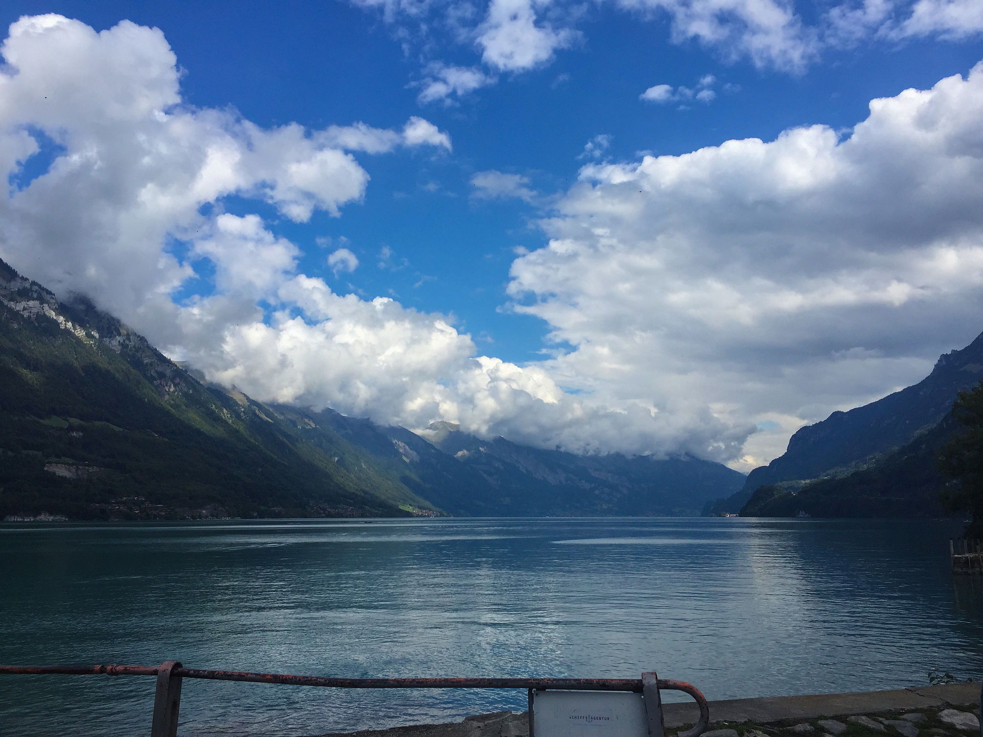
I like your concept and think the brand you chose matches your aesthetic very well. I really liked the set up of these pages. The masking tape is a nice touch. Like Belle said, your collection is heavy with saturated images and colors. I would like more of a balance. Even just turning down the saturation on some of the colors would go more with your calming/healing theme. The samples are awesome. I absolutely love what you did with the logo. You are on the right track and seem to understand this brand.
I love the knit samples with the logo! Really great idea. For the colors, I would suggest a knew background image. With the way you have it, the background image is very saturated with no natural colors in it. Your color palette, however, has both very saturated colors as well as basic neutrals. I think you should find a photo that balances this out a little more, and I also think you should take out the yellow. Lastly, I would love to see more in terms of a visuals on the brand you chose. I think it would help to get your point across on what you can add to the brand by showing us what they already have.
You have a good range of colors that are chill and down to earth. I can't wait to see more knit sample. The idea of putting Black Dimond's logo in a knit looks very edgy. Keep up the good work.